Colour Of The Month: Beautiful Blues
By Ana Zuravliova
Thanks to popular culture, blue is wrongly seen as a miserable colour. We don’t agree with that and today, we’ll show you just how refreshing and energising shades of blue can be. To achieve this, we’ll be looking at the paler end of the spectrum, from petrol blue to turquoise, and a lot in between.
The benefits of blue in interior design
Few colours stir emotion as deeply within us as blue. We recently covered the benefits of dark blues in our Colour Focus: Dark Blue blog, however lighter shades of blue provide equally emotive and positive vibes in a space.
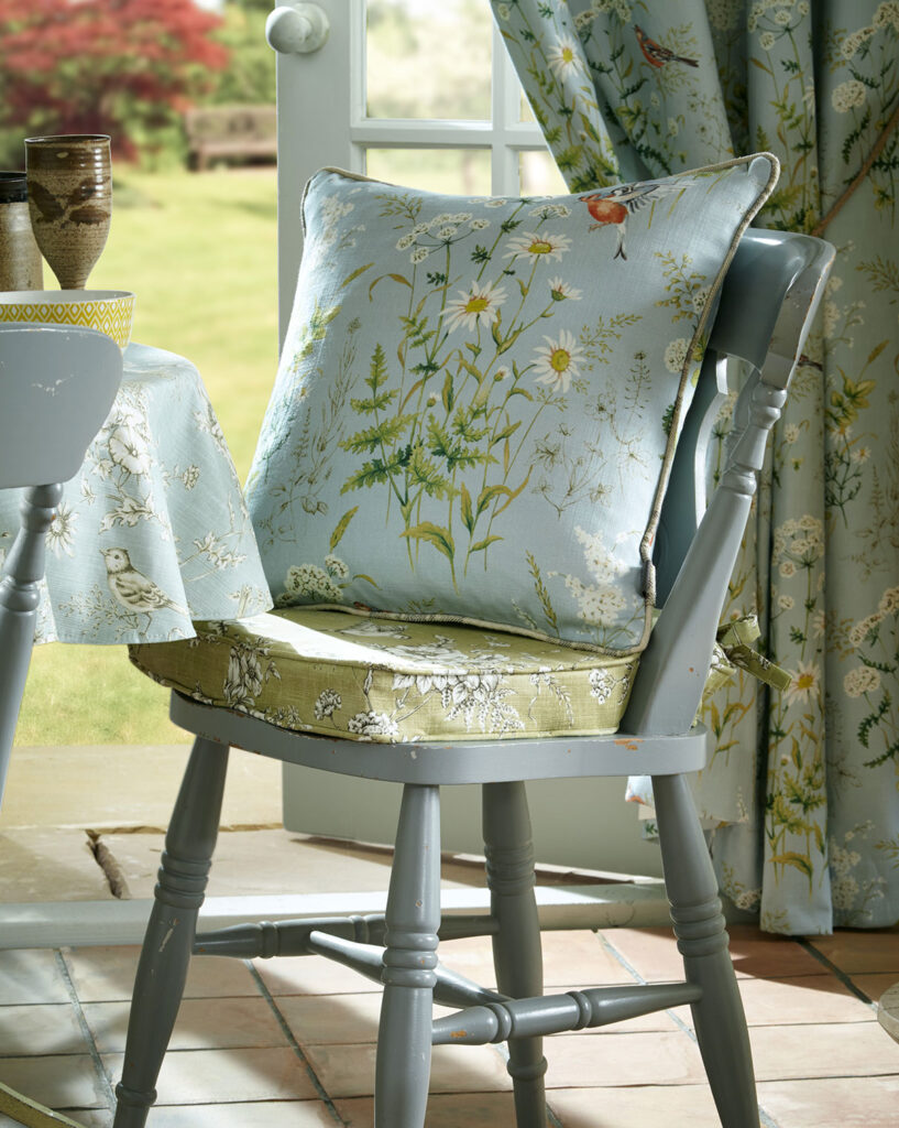
Pale blue makes us feel of limitless potential. It conjures memories of the sky and the sea, both of which have inspired countless generations to do great things. This feeling of calm and peace, which light blue embodies, can be enjoyed around the home. Bathrooms, kitchens and living rooms in particular benefit from a well-chosen pale blue shade.
While it’s not associated with a warming feeling, light blues are also great in the bedroom, especially when it’s a more interesting tone such as a seafoam or closer to turquoise. These tones will help you unwind and relax following the rigmarole of the day.
Let’s take a look at some specific pale blues…
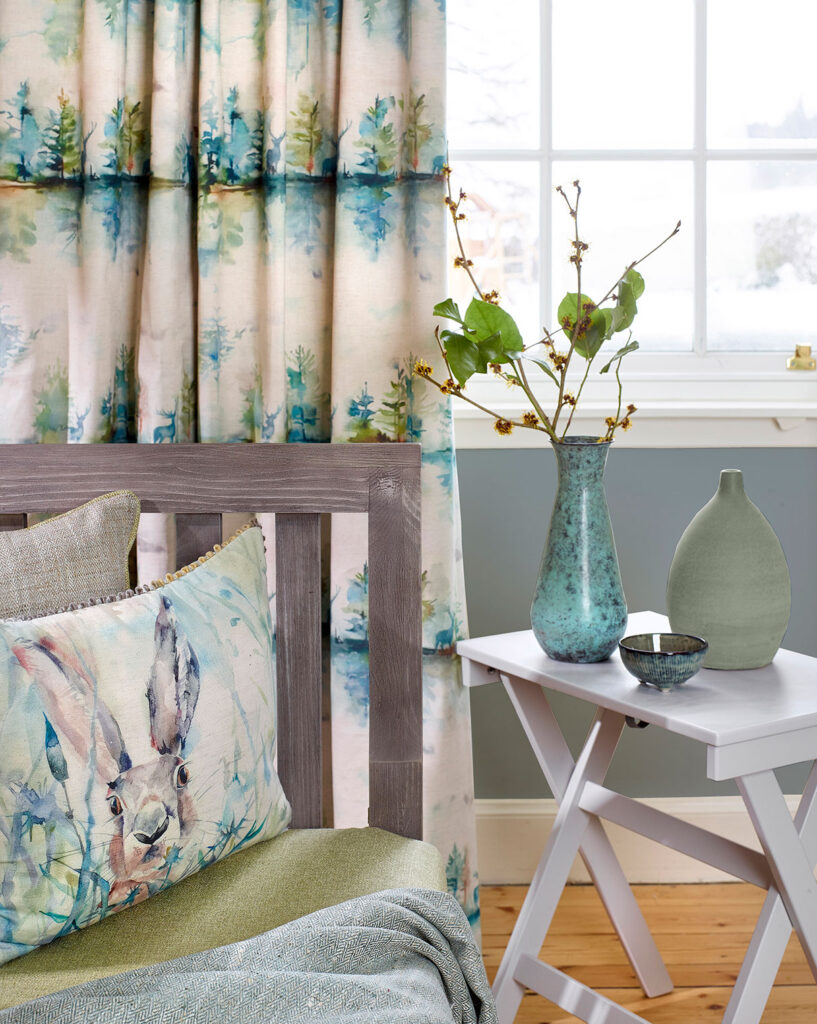
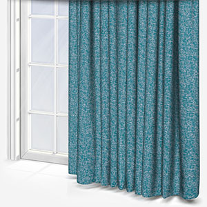
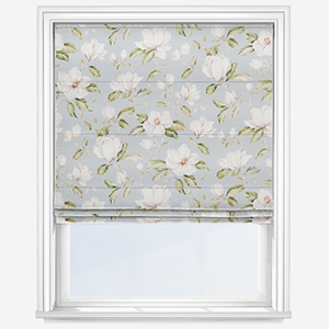
Turquoise interior design
Turquoise is a fantastic shade for interior design. Its subtle, invigorating and what’s more, it partners well with a great selection of other colours.
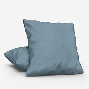
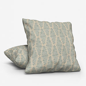
Blue-green tones such as this are linked to the natural world, good health and stability. They work particularly well in a Roman, vertical, or roller blind; especially if a similar shade is used through out a room, for example a sofa, cushions, pillows, or lampshades.
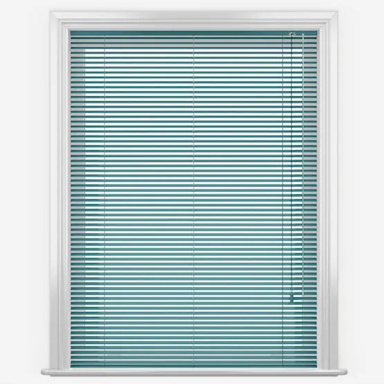
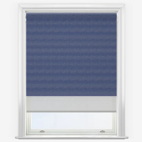
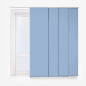
Sky blue interior design
Compared with aquamarine, sky blue is paler, more “bluer”, shade of blue. This tone is eminently energising and is the perfect colour to mix into a predominantly white space. If your space is mostly white – any shade of white – look to sky blue as a block colour. Again, Roman, roller and curtains are an excellent starting point.
Moreover, sky blue is a brilliant addition to a darker shade of blue, particularly since it will make the space and colour pop. To achieve the best effects with its darker cousin, consider using sky blue as a part of a broader pattern, or as a spot colour. Cushions, lamp shades, and a supporting role in a patterned curtain are easily some of the best ways to enjoy this colour.
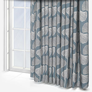
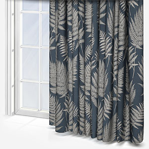
Petrol blue interior design
The one word that best sums up petrol blue is, “vivid”. This is a very bold colour which can fuel the energy and positivity of a space. The easiest way to use petrol blue is as part of a contemporary interior design scheme however, when done correctly, you can enjoy a fun twist on traditional design too.
For a modern space, look to sleek, angular designs – whether it’s the shape of the furniture or the patterns featured upon them. Also look to use petrol blue in a soft material that’s pleasant but reserved. Wools and linens are fantastic options.
To play with traditional interior design, petrol blue works equally well with velvet and more rounded pieces of furniture.
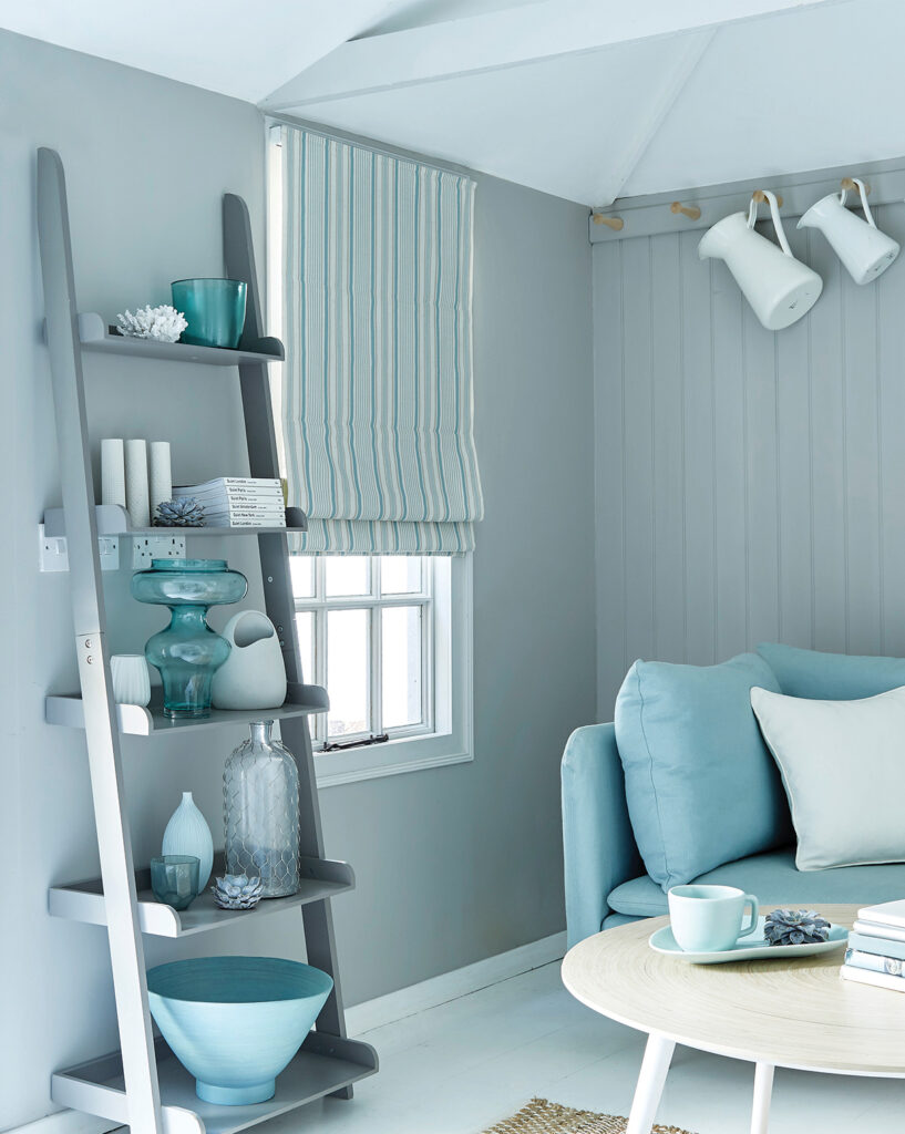
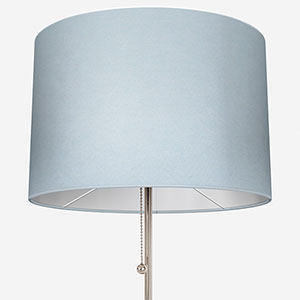
Powder blue interior design
Pastel shades of powder blue are on the cooler side of the light blue spectrum. Because of the delicacy of this tone, it’s a great primary colour for a space – particularly a relaxing space.
Large windows would benefit from an elegant powder blue curtain or Roman blind while the smaller windows in the bathroom would likewise benefit from a lovely roller blind. Because of the paler nature of powder blue, you can avoid patterns if you wish, this is because the light will interact beautifully with the colour, especially in a flowing window furnishing such as a curtain.
powder blue works extremely well with other colours too. Whether you want spots of white, indigo or even shining yellows, powder blue will help to bring everything together.
For more information about colour, be sure to check out our colour of the month series on the blog. Additionally, if you can decide on which shade of blue is best for your home, don’t forget you can order up to eight free samples to see your shortlist shades in the flesh at Blinds Direct.
Share this post
Other posts you may be interested in

Colour Of The Month: Going For Gold
By Ana Zuravliova
Pantone’s Colour Of The Year 2023 – Viva Magenta
By Ana Zuravliova
Colour Of The Month: Going For Gold