A Social Snapshot: A Fabulous February
By Ana Zuravliova
Throughout February we’ve been investigating how readers can better love their homes, and this month’s social snapshot blog showcases some homes that are clearly loved and cared for! There has been some amazing content shared with us via social media, and today we’ll be showcasing three of our top picks!
Our favourite social posts from February
With the end of February, many of us will be looking to the imminent start of spring and the passing of winter. In this month’s social snapshot, you can feel that optimism with warm colours, fantastic use of light and pure creativity. Read on to find out more about our favourite posts from February!
Looking back at blue
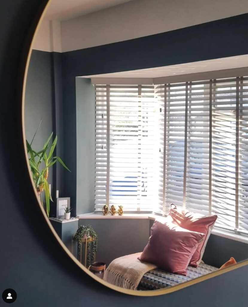
Our first image comes from hadleyhouseandhome and its striking decor is presented in an interesting way.
Let’s start with the colours. Ordinarily, you may think that blue is a winter colour, symbolising the cold but while that may be true for some blue shades, you can have warm blues. In this space we can see how hadleyhouseandhome has used a dark grey blue to add a soothing yet comfortable edge to their space. By choosing a dark, powdery shade of blue, you can add a surprisingly warm effect to your decor. Moreover, the addition of pink cushions and waxy green leaves helps to make the whole space pop, as too does the white used at the top of the wall.
Light is what makes these colours come to life, and the window furnishing couldn’t be better for this purpose. The white wooden Venetian blind looks extremely stylish but by angling the slats to the required position, hadleyhouseandhome can find the perfect balance between light and privacy. Will you give dark blue a try? We think it’s a hit!
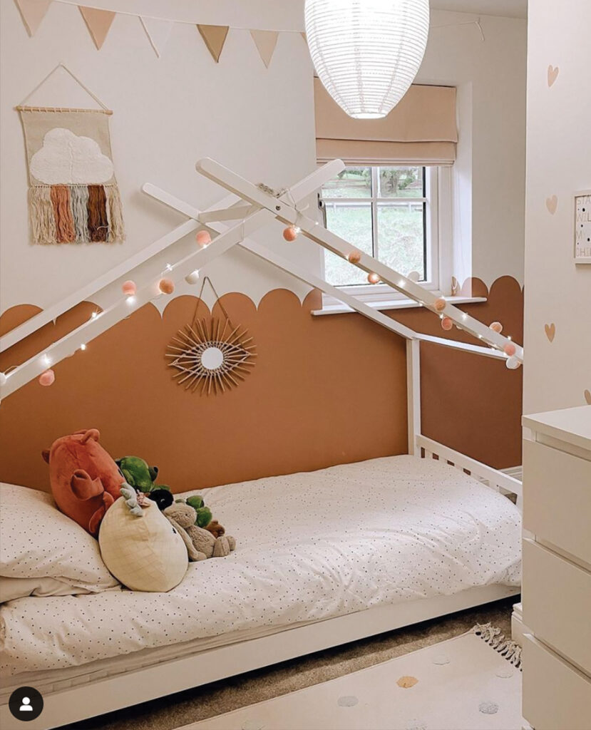
Transforming with terracotta
Terracotta is one of those colours that will make any space feel cosier, more wholesome and energising. Need proof? Check out this amazing child’s room from sherlocks_at_no26!
Keeping to a limited colour palette, this room makes great use of terracotta shades on the walls and beautiful Roman blind, alongside warm tones of white and fantastic use of tiny accent colours ranging from the vibrant tassels on the wall hanging through to the colourful cuddly toys. These hues work amazingly well and when combined, will manifest a decor that’s clean, chic, and charismatic!
Beyond the awesome use of colour, this room also makes spectacular use of shape and form. While the colours contrast with one another, so too do the shapes. For instance, one of the most eye-catching elements of this space are the arches formed between the terracotta and the white. Juxtaposing with the smooth shapes are the triangles found in the bunting further up the walls, and the hearts on the perpendicular wall. This image certainly proves the value of attention to detail.
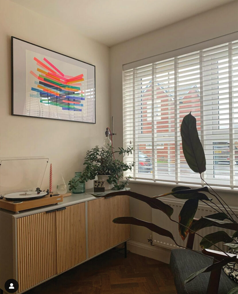
A chic escape
Our final image comes from maidstone_barrattwiltshire and it looks like the perfect relaxation space.
The combination of the pure white Venetian blinds with the vibrant colours found in the artwork offers similarity with the strong right angles but in a playful way. The use of right angles continues through this sophisticated room with the rectangular cabinet and the vintage inspired record player. Contrasting with this are the plants. There is an old saying that nature abhors a straight line, so if your decor features a lot of sharp angles, add plants to break it up a little.
While featuring a limited colour palette, this photograph showcases what you can do with the right colours – even if there aren’t many of them. Maidstone_barrattwiltshire’s image captures a feeling of scandi style with a sleek modern edge. By sticking to a mostly neutral palette, you can enjoy little splashes of bold colours as found in the artwork. Don’t forget to let light in to maximise the style of the space – a Venetian blind will help you let in light while staying private perfectly.
February hasn’t disappointed with the sublime interior design styles shared with us on Instagram. If you want to feature in our March blog, make sure to tag us in your images on Instagram, our handle is @blindsdirectgb. We can’t wait to see what you’ve been working on!
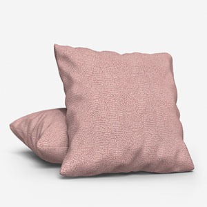
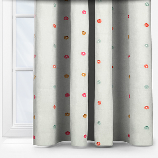
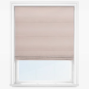
Shop some of our favourite products featured in, and inspired by these posts: